Looking to create eye-catching, interactive infographics?
Here’s a quick rundown of the best interactive infographic tools for 2024:
- Infogram: Best for data visualization
- Visme: Great for beginners, AI-powered design suggestions
- Genial.ly: Excels in interactivity and animation
- Tableau Public: Powerful for complex data analysis
- Piktochart: User-friendly with business-focused templates
I partner with awesome companies that offer products that help my readers achieve their goals! If you purchase through my partner links, I get paid for the referral at no additional cost! For more information, visit my disclosure page.
Quick Comparison
| Tool | Best For | Ease of Use | Data Handling | Pricing Starts At |
|---|---|---|---|---|
| Infogram | Data viz | Moderate | Excellent | $19/month |
| Visme | Beginners | Easy | Good | $12.25/month |
| Genial.ly | Interactivity | Moderate | Basic | €7.49/month |
| Tableau Public | Complex data | Challenging | Advanced | Free |
| Piktochart | Business use | Easy | Good | $14/month |
Each tool has its strengths.
Pick based on your data complexity, design skills, and budget. With these tools, you’ll be creating engaging infographics in no time.
Related video from YouTube
1. Infogram
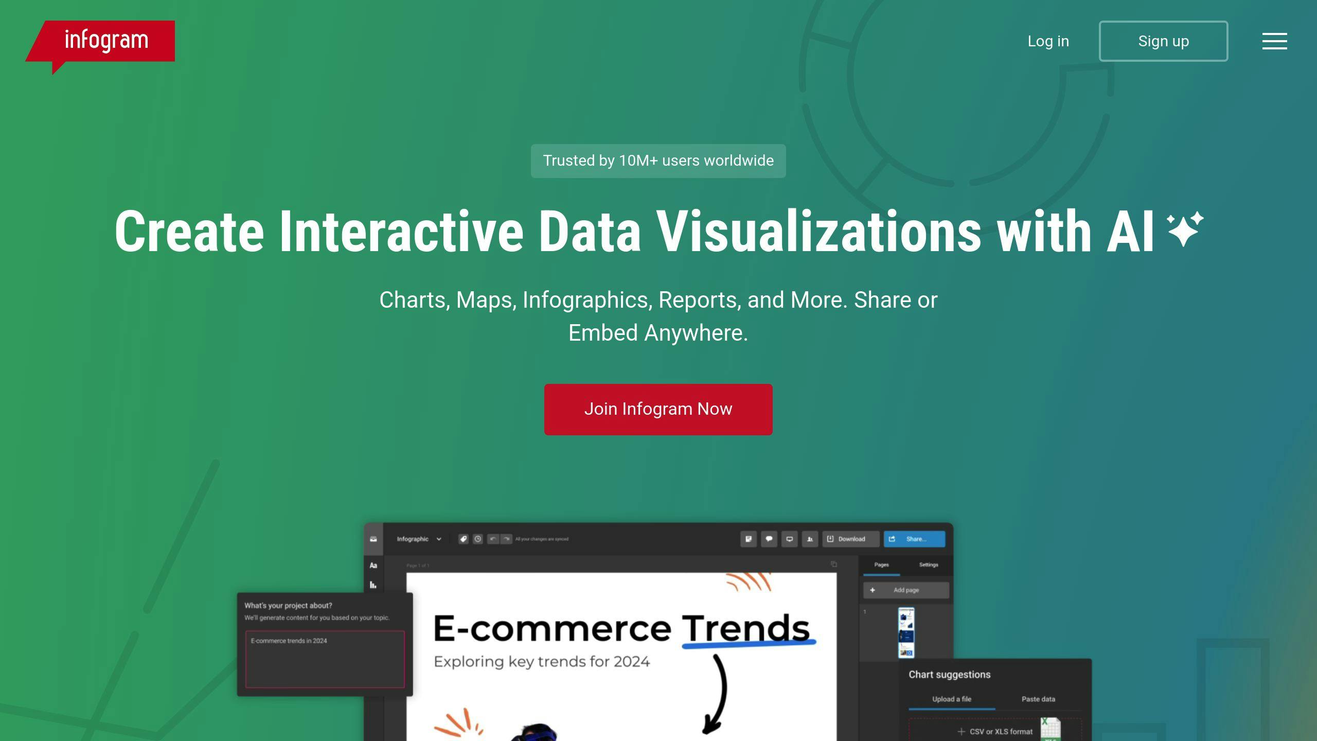
Infogram is a top-notch tool for creating interactive infographics. It’s designed to be easy for beginners but powerful enough for pros.
Here’s what makes Infogram stand out:
- It turns complex data into eye-catching charts, graphs, and maps
- You can drag and drop elements to create visuals (no design skills needed)
- Teams can work together in real-time
Infogram offers different plans to fit various needs:
| Plan | Yearly Price | What You Get |
|---|---|---|
| Basic | Free | Basic stuff |
| Pro | $19/month | More options |
| Business | $67/month | Brand features |
| Team | $149/month | Advanced team tools |
| Enterprise | Custom | Tailored for you |
Pro users and up can link Infogram to Google Sheets. This means your charts update automatically when your data changes.
Pretty neat, right?
Infogram also lets you add cool interactive features:
- Hover tooltips
- Clickable legends
- Scroll-activated animations
These make your infographics more engaging and let viewers dig deeper into the data.
Plus, Infogram gives you analytics on how people interact with your content. This helps you make better infographics over time.
One user said: “Infogram is extremely useful for presenting infographics and charts, something that would take up significant time for me to create from scratch.”
Some users wish for more customization options in cheaper plans. But for most people, Infogram has plenty to work with.
If you want to step up your data storytelling game in 2024, Infogram is worth checking out. It’s all about making it easy to create powerful, interactive visuals.
2. Visme
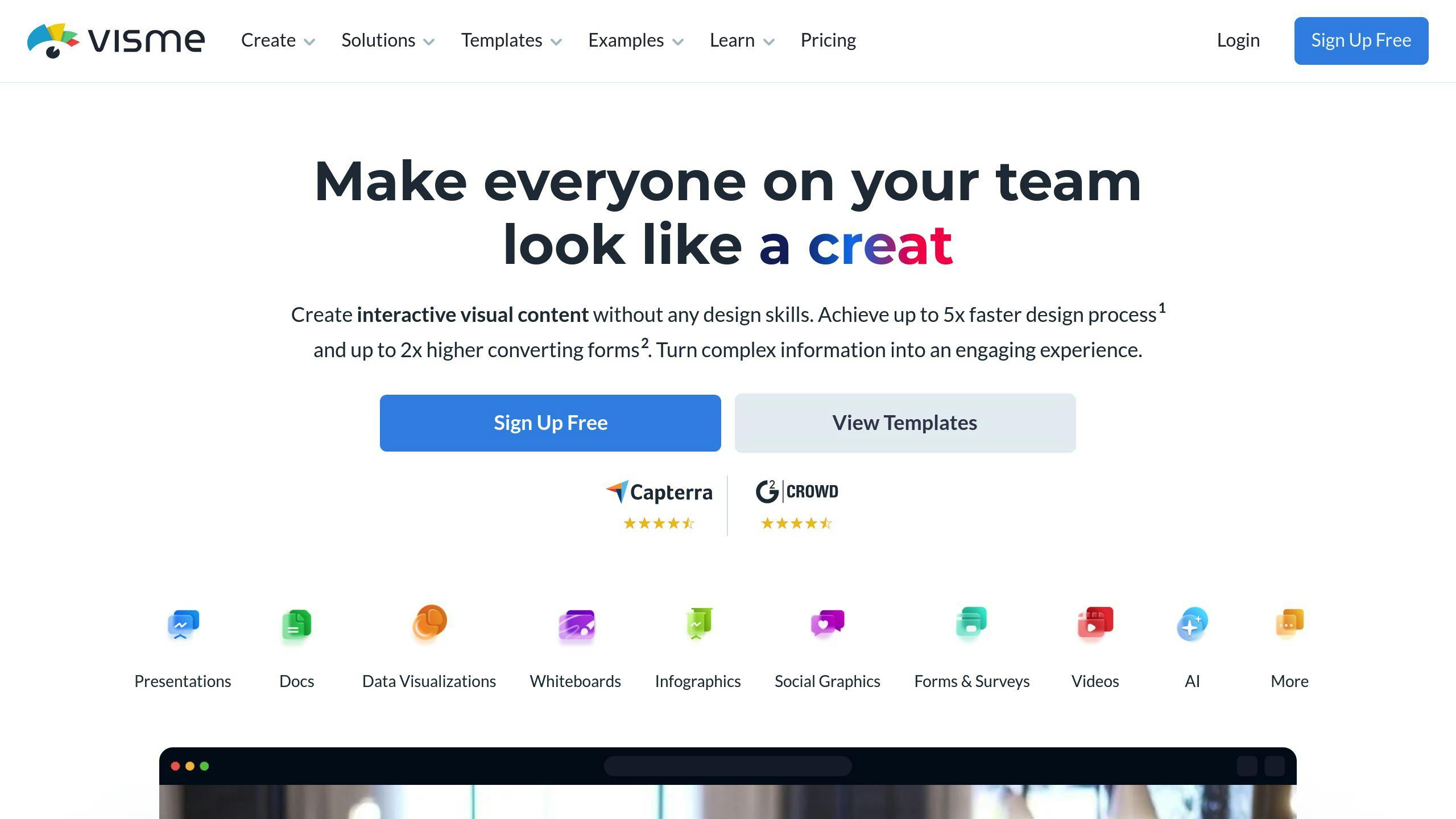
Visme is a go-to tool for creating eye-catching infographics and data presentations. With over 25.8 million users, it’s clear that Visme’s onto something good.
Here’s what makes Visme stand out:
- Easy-to-use drag-and-drop editor
- Huge library of templates
- Focus on interactivity
You can add animated illustrations, embed videos, and create pop-ups. It’s like your data just came to life!
Visme’s got a neat trick up its sleeve: an AI-powered image suggestion tool. It helps you find the right stock images based on your design. Pretty cool, right?
But where Visme really shines is data visualization. It turns boring numbers into visuals that pop. Animated charts and graphs? Check. Automatic animations? Double-check.
“Visme has done a lot of research into conversion rates, to see what sort of form layout generates the most signups – and their studies reveal that interactive forms involving animated characters are likely to perform best.” – Chris Singleton, Author
This quote shows Visme isn’t just about looking good – it’s about getting results. Their online form maker with customizable animated characters is designed to boost those all-important conversion rates.
When you’re done creating, Visme gives you options.
Share via a link, embed on a website, or download as an HTML5 file. Your animations and interactivity stay intact, even offline.
Here’s a quick look at Visme’s pricing:
| Plan | Monthly Price | Annual Price (per month) |
|---|---|---|
| Basic | Free | Free |
| Starter | $29 | $12.25 |
| Pro | $59 | $24.75 |
| Enterprise | Custom | Custom |
The free plan is limited, but the paid tiers unlock all the interactive goodies.
For teams, Visme’s collaboration features are a time-saver. Users report spending less time in meetings and more time creating.
Bottom line: If you want to create interactive infographics that grab attention and get results, Visme’s worth a look. It’s user-friendly, great with data, and packed with interactive features. For visual content creation in 2024, Visme’s hard to beat.
3. Genially

Genial.ly is a cloud-based platform that’s changing the game for interactive infographics. It’s perfect for content creators who want to make their data pop without needing to code.
Here’s what makes Genial.ly special:
- It’s all about interactivity and animation
- You can turn boring stats into eye-catching experiences
- The drag-and-drop editor is super easy to use
With Genially, you can add cool stuff like:
- Popup windows
- Clickable elements
- Mouseover effects
- Animated charts and graphs
But don’t think it’s just for show. Genial.ly is a serious tool with over 1,300 templates across 12 categories. Whether you’re making a presentation, infographic, or even a game-like learning experience, they’ve got you covered.
One of the best things about Genially?
You can mix in all sorts of content. YouTube videos, audio files, Google Docs, PDFs, social media posts – you name it. This means you can create rich, multimedia infographics that keep people hooked.
“Every time I present using Genially, the general audience consensus is ‘WOW’ every single time, and I always have people asking what tool I used.” – A Digital Learning Coach
It’s not hard to see why people love it.
Genially creations look great and are easy to share. You can put them right on your website or blog, which helps more people see and interact with them.
Worried about accessibility? Don’t be.
You can share your Genially creations in lots of ways:
- Via link
- By email
- On social media
- As interactive PDFs
- As JPG images
- In a view-offline format
Here’s a quick look at Genially’s pricing:
| Plan | Price | What You Get |
|---|---|---|
| Free | €0/month | Basic tools, some templates |
| Pro | €7.49/month | All templates, premium stuff |
| Master | Custom | Advanced features, team tools |
The free version is pretty good, but if you want all the interactive bells and whistles, you’ll need to pay.
Want to make the most of Genially?
Here are some tips:
- Plan first. Know your main message before you start designing.
- Use templates to save time, but make them your own.
- Don’t go overboard with animations. They should help your message, not hide it.
- Test everything before you publish. Make sure it works on all devices.
4. Tableau Public
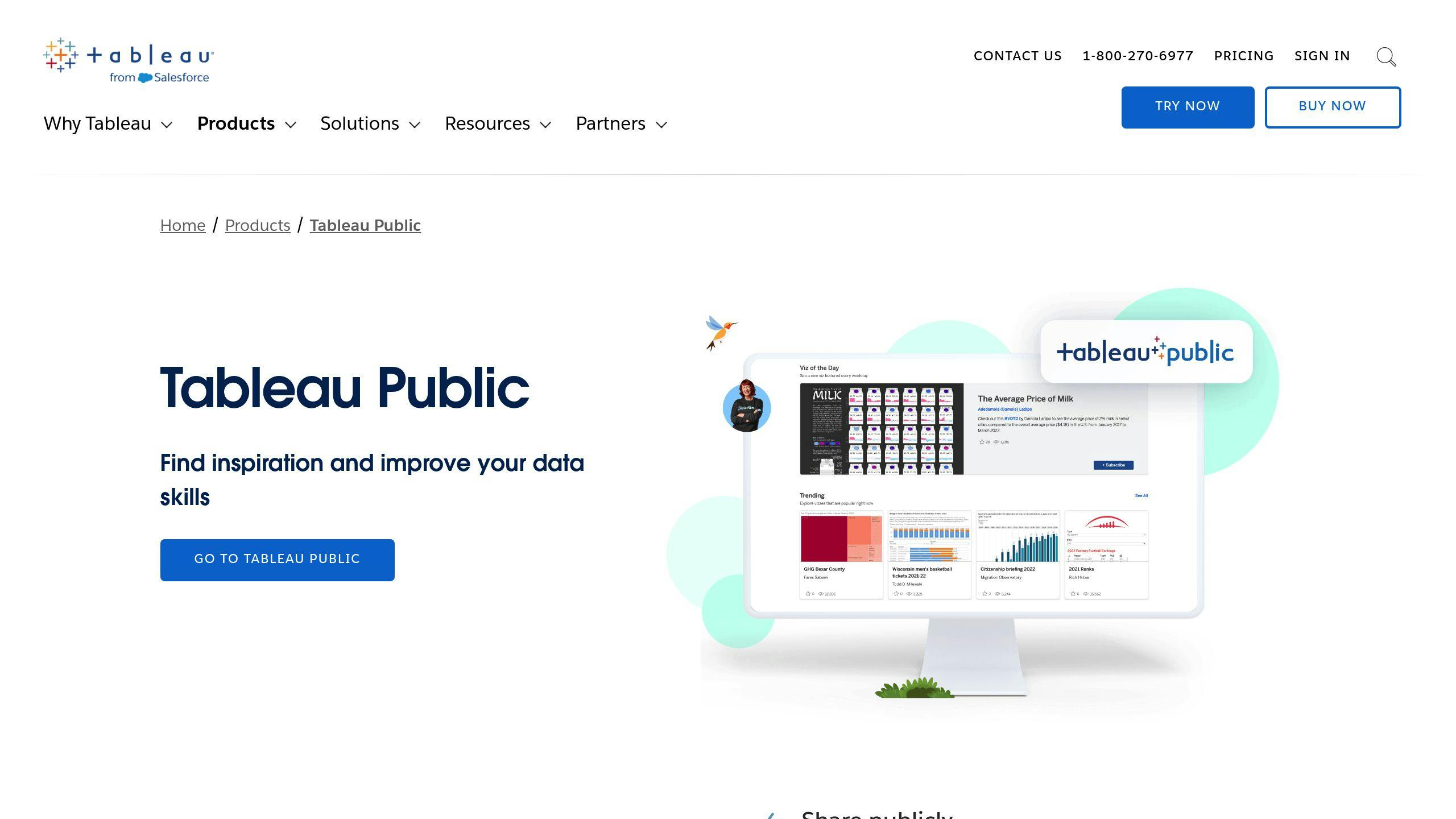
Tableau Public turns complex data into interactive eye candy. It’s the free version of Tableau’s data viz software, open to anyone who wants to tell stories with numbers.
What’s the big deal?
Tableau Public transforms dry data into clickable, explorable charts and dashboards. It’s like giving your spreadsheets a Broadway debut.
Here’s why it’s hot in the interactive infographic world:
- Data Becomes a Story: Tableau Public shines at narrative-building. You can craft anything from basic bar charts to multi-layered data experiences. The kicker? Your audience gets to play with the data, uncovering insights on their own.
- No Coding Required: While there’s a learning curve, you don’t need to be a tech whiz. The drag-and-drop interface lets you experiment freely.
- Learn from Others: Tableau Public is more than just software – it’s a community. Users share work, get inspired, and level up their skills together.
Take the ‘Data Snap‘ project at UNC Chapel Hill. Student Spencer Stone used Tableau Public to visualize North Carolina county data. The result? An interactive dashboard that makes comparing county metrics a breeze.
Spencer said: “Data Snap: Power Policy with Numbers took months of data wrangling. But Tableau Public turned that into approachable, easy-to-access graphs.” He added, “Excel can’t compete with vivid, interactive maps and charts for impact.”
This project shows how Tableau Public can make even policy analysis engaging and accessible.
But it’s not all roses.
Keep in mind:
- Everything’s public by default. Not great for sensitive data.
- There’s a 10GB storage limit and a max of 1,000,000 rows per file.
- It takes time to master. As one user put it: “The software’s goals make sense, but some training helps navigate it effectively.”
Even with these hiccups, Tableau Public is a top pick for interactive infographics in 2024. It’s a powerhouse combo of features, community, and free access – perfect for data nerds, journalists, teachers, or anyone wanting to make numbers talk.
5. Piktochart

Piktochart is a go-to tool for creating interactive infographics. It’s perfect for business folks and teachers who want to turn boring data into eye-catching graphics.
Here’s the deal: You don’t need to be a design wizard to use Piktochart. It’s super easy to use, even if you’ve never made an infographic before. They’ve got over 600 templates you can tweak to your heart’s content.
Now, let’s talk data. Piktochart lets you link your Google Sheets directly to your graphics. That means your charts and graphs update automatically when your data changes. Pretty neat, right?
Here’s what it’ll cost you:
| Plan | Price | What You Get |
|---|---|---|
| Free | $0 | 5 designs, 2 downloads/month |
| Pro | $29/month or $168/year | No limits on designs or downloads |
| Business | $49/month | Fancy features, more storage |
The free version is okay for dipping your toes in, but if you’re serious about infographics, go for the Pro plan. It’s the best bang for your buck.
“Piktochart is better if you are a professional and only want to make infographics and presentations for your business”, says Ivanna Attié, Senior Content Manager and Market Analyst.
Here’s something cool: Piktochart has AI. Just describe your data, and it’ll suggest templates for you. It’s like having a design assistant at your fingertips.
Worried about SEO? Don’t be.
Piktochart’s HTML publishing makes sure search engines can read your infographics. That’s huge for getting your content noticed online.
And get this: In just 3 years, over 3 million people started using Piktochart. That’s a lot of infographics!
Quick tips for using Piktochart:
- Start with a template to save time.
- Use high-quality images to make your infographic pop.
- Keep it simple. Don’t cram in too much info.
- Use the data tools to make your stats crystal clear.
Just remember, the free version is pretty limited. If you’re going to be making infographics regularly, you’ll probably want to pay for a plan.
Bottom line: Piktochart is a solid choice for 2024 if you need to make interactive infographics. It’s especially good for business and education stuff. If you want to turn data into visuals that people actually want to look at, give Piktochart a shot.
How These Tools Compare
Let’s break down how Infogram, Visme, Genial.ly, Tableau Public, and Piktochart stack up against each other in key areas.
Data Handling
Infogram is a data viz powerhouse. With 35+ chart types and 800+ map types, it turns complex data into eye-catching visuals. Tableau Public takes it up a notch, letting users create multi-layered data experiences for viewers to explore.
Visme and Piktochart? They’re solid for data viz, but they’re more about general infographic creation. Genial.ly is great for interactivity, but it’s not as focused on heavy data visualizations.
Ease of Use
Piktochart and Visme are the user-friendly champs. Their drag-and-drop interfaces make infographic creation a breeze, even for newbies. As Piktochart’s Senior Content Manager, Ivanna Attié, puts it:
“Piktochart is better if you are a professional and only want to make infographics and presentations for your business.”
Genial.ly and Infogram have a bit of a learning curve but offer more advanced features. Tableau Public? It’s powerful, but it needs the most technical know-how.
Collaboration Features
For team use, Visme and Piktochart offer robust collaboration tools across all plans. Infogram locks team features behind higher-tier plans (starting at $149/month for Pro Team). Genial.ly and Tableau Public? Basic sharing and collaboration, but not as comprehensive.
Pricing
Here’s the lowdown on starting prices for paid plans:
| Tool | Starting Price (Monthly) |
|---|---|
| Genial.ly | €7.49 |
| Piktochart | $14 |
| Visme | $12.25 |
| Infogram | $19 |
| Tableau Public | Free |
Tableau Public is free, but remember: all your work is public. The others offer free plans with limited features – good for a test drive before committing.
Unique Strengths
Each tool has its secret sauce:
- Infogram: Live data updates keep your visualizations fresh.
- Visme: AI Designer generates designs from text prompts.
- Genial.ly: Specializes in highly interactive content.
- Tableau Public: Handles large, complex datasets like a pro.
- Piktochart: Balances ease-of-use with professional-looking results.
Choosing a tool? Think about your needs. Dealing with complex data? Look at Tableau Public or Infogram. Need quick, pro-looking infographics? Consider Piktochart or Visme. Want highly interactive content? Genial.ly might be your jam.
Final Thoughts
After checking out the top 5 interactive infographic tools, it’s clear each one has its own sweet spot.
Here’s a quick rundown to help you pick the right tool for your project:
Got a ton of data?
Tableau Public and Infogram are your best friends. Tableau Public is a beast with complex datasets – perfect for data nerds and researchers. One user said it turned months of data wrangling into “approachable, easy-to-access graphs.”
Pretty cool, right? Infogram’s not far behind with its 35+ chart types and 800+ map types. It’s great for turning data into eye-catching stories.
New to design? No worries.
Piktochart and Visme have got your back. Piktochart’s super easy to use and has tons of templates. You’ll be whipping up pro-looking infographics in no time. Visme even has an AI Designer that can create designs from text prompts. Talk about a lifesaver for non-designers!
Want your infographic to pop? Genially is where it’s at. It’s all about interactivity and animation. Your viewers won’t be able to stop clicking and exploring.
Need to work with a team? Visme and Piktochart offer solid collaboration features on all their plans. No more email ping-pong with your coworkers.
Watching your wallet? Tableau Public is 100% free, but remember – your work will be public. If you’re cool with paying a bit, Genial.ly starts at €7.49/month, which isn’t too shabby for premium features.
When you’re making your choice, think about:
- How complex is your data?
- What are your design skills like?
- How interactive do you want your infographic to be?
- Are you working solo or with a team?
- What’s your budget looking like?
Pick the tool that fits your needs best, and you’ll be creating awesome interactive infographics in no time!
FAQs
How can I create interactive infographics?
Want to make your data pop? Interactive infographics are the way to go. Here’s how to create one using Infogram:
- Log in to Infogram and pick a template (or start fresh)
- Add charts, images, and icons to show your data
- Upload or paste your data into the tool
- Make it yours with brand colors, fonts, and graphics
- Download or embed on your site
It’s all about finding that sweet spot between looks and substance. As Daniela from Visme puts it:
“Creating interactive infographics isn’t just about making them pretty. It’s about turning complex info into something easy to digest.”
Want to kick it up a notch? Try adding:
- Clickable buttons for more info
- Hover effects to highlight key points
- Embedded videos or animations to explain stuff
No coding skills? No problem. Tools like Genially let you drag and drop these interactive bits right in.
When you’re putting it all together, remember:
- Know what you want your infographic to do
- Stick to a color scheme and font style
- Double-check your data
- Make sure it works on different devices
With these tips, you’ll be creating eye-catching, informative infographics in no time.

